Image Buttons
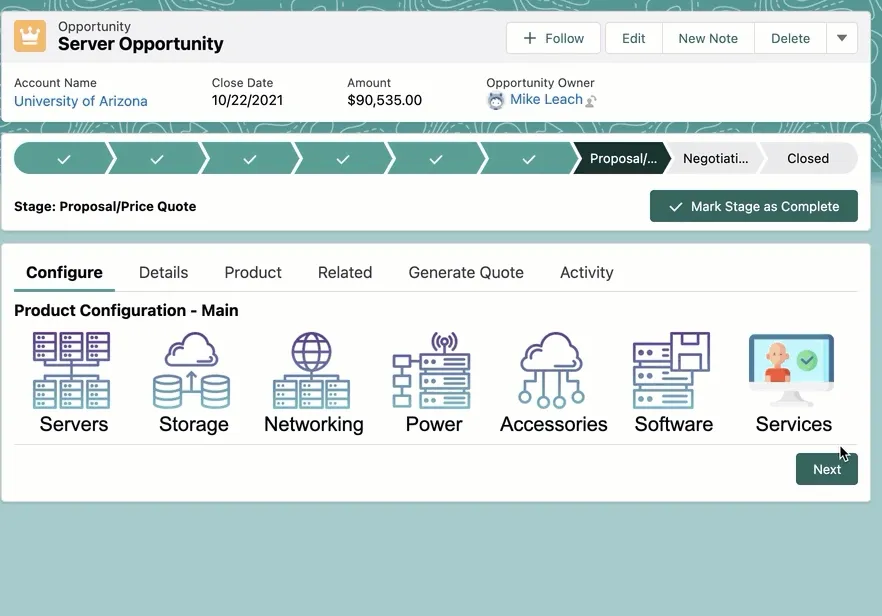
Image buttons and icons are a great way to visually assist Sales Reps and guide them through product configurations.
Start by representing major product families with image buttons, then progress to adding more images for sub-categories, bundles, and actual products.
Getting Started
From a screen flow, locate the “Custom” section under Components and drag-and-drop the “iDialogue Product Images” component onto the screen layout.
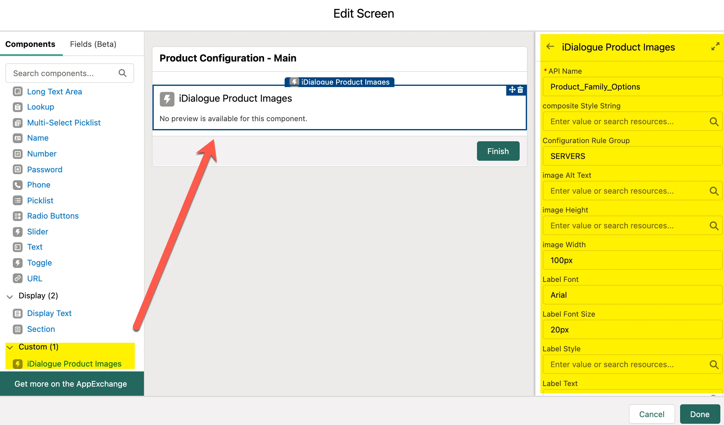
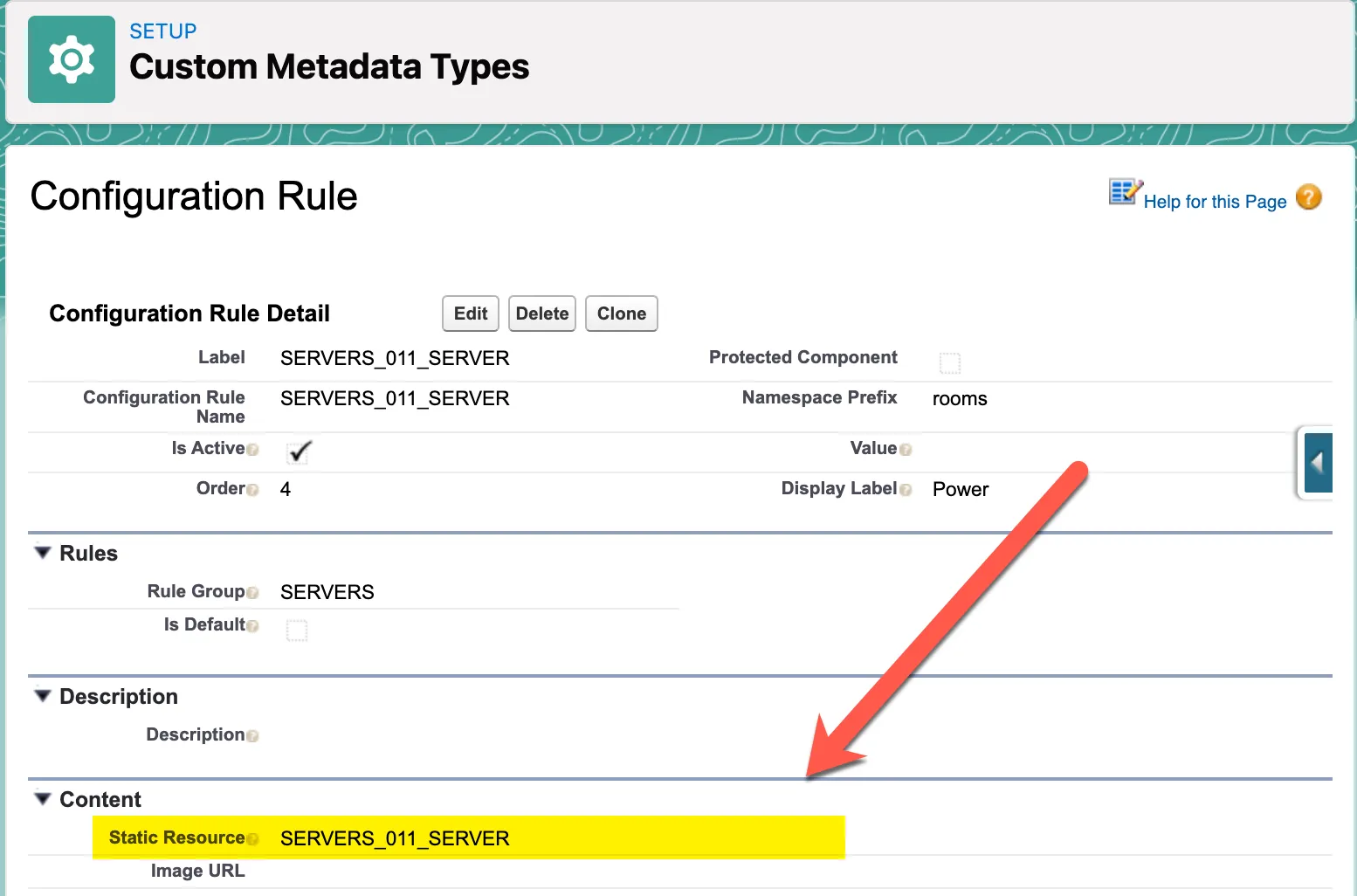
The “Configuration Rule Group” is the most essential property to be defined. This represents a group of active Configuration Rule records. This is a custom metadata record type (API name roomsConfigurationRulemdt).
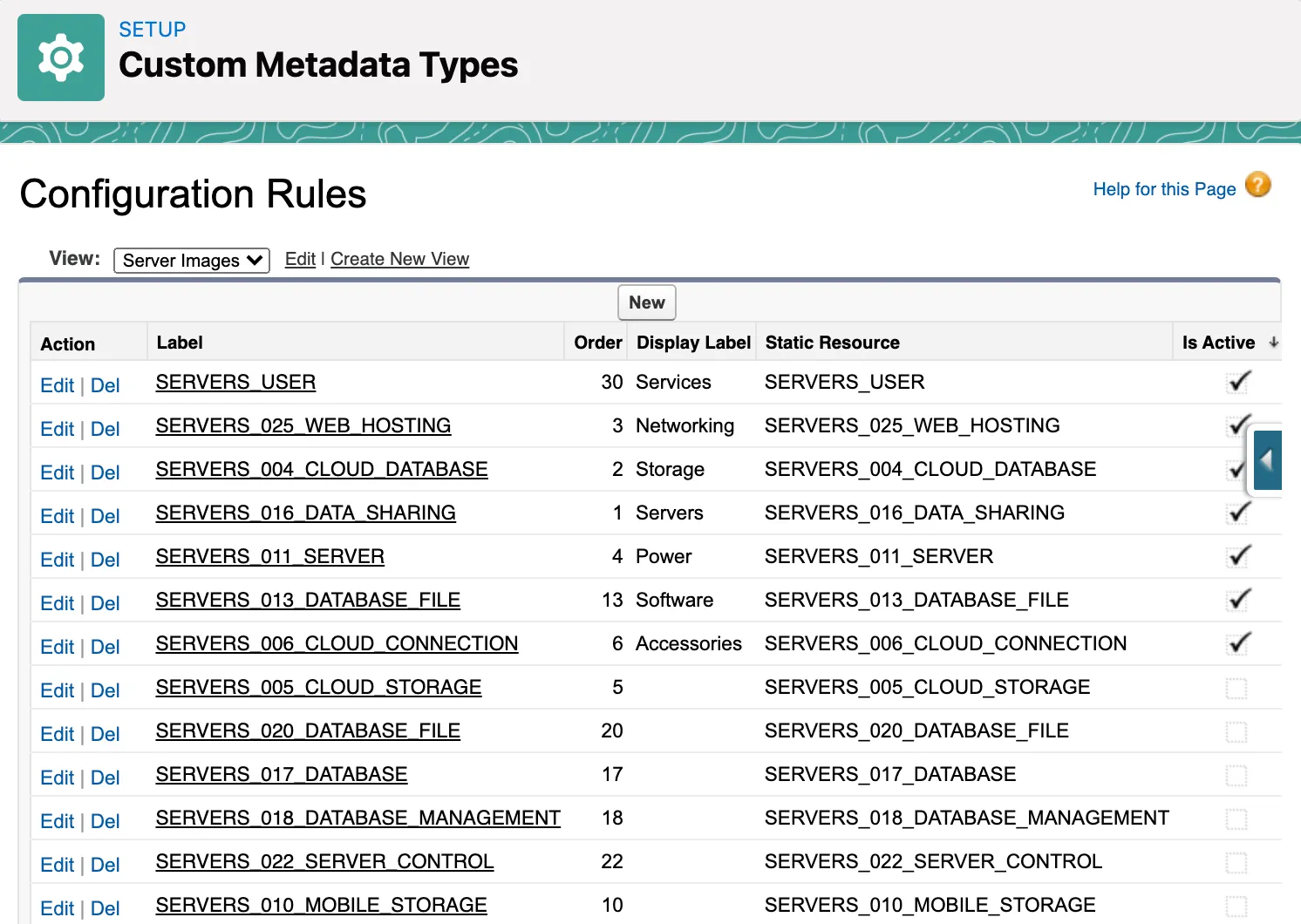
Each rule refers to a Static Resource and Display Label. The static resource is the image displayed in the screen flow. The Display Label is the product family or product name.
Group several images together by defining a common “Rule Group”. It’s this rule group name that is referenced in the product image component.
Every style attribute; from image height, width, font family, padding, size; are all configurable and customizable under the component properties.
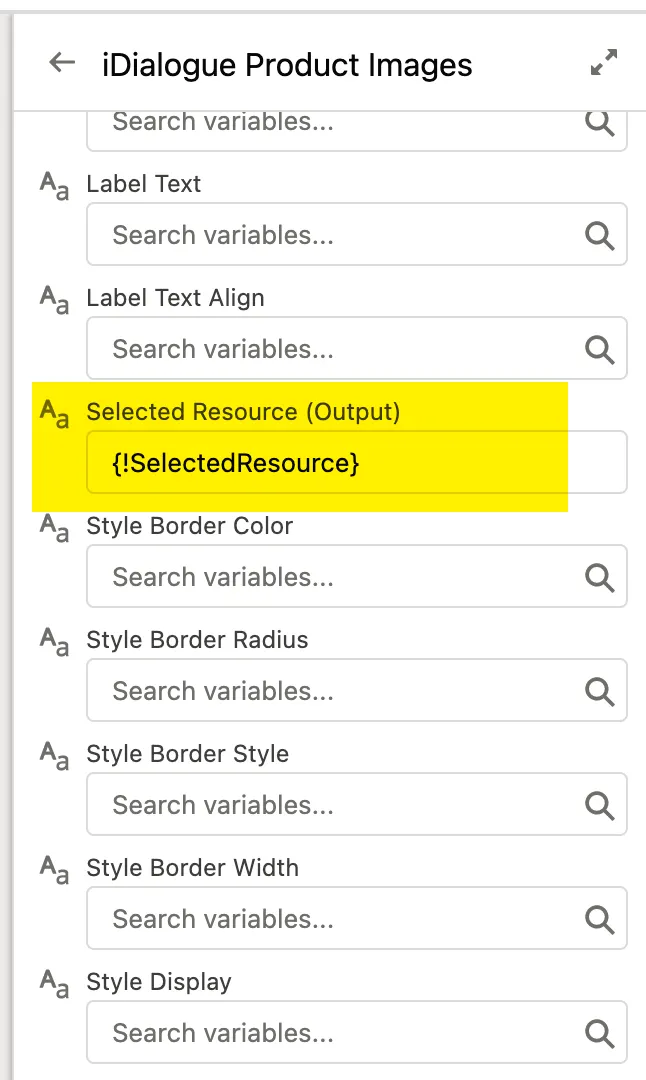
Capturing Button Selection
Clicking on a button passes the selected static resource name to the next screen via the output variable named “Selected Resource”.
Create a Text variable named “SelectedResource”. Assign the component output to this variable. Then pass this variable as an input to a sub-flow.
This is the basic construct to building CPQ decision trees using iDialogue Flow CPQ.